


How long have you been illustrating and creating art?
My dad and granddad have always drawn in their spare time. Growing up, I was entertained with pencils and paper while my cousins played football. Since then, it’s something I have always done. My dad's comic collection from the 80s were a big influence, and punk bands opened my eyes to a broader scene, where I came to find lots of queer artists to look up to.
Tell me about the inception of FreeTime.
In 2016 I launched my fanzine FreeTime with my friends’ studio; a series of blue portraits I put together in my spare time. From there we opened the concept to a wider field, celebrating everyone's individuality through their “free time”, celebrating community, and inviting different individuals to collaborate with the printed edition.

What did the project entail? And where did the idea come from?
It began as a fanzine with stickers and posters, screenprints and a series of t-shirts done in my spare time. The idea came around with my friends Helena and Rocio, Parisian studio Faye and Gina, based on a shared appreciation for printed editions, fanzines, DIY, merchandising and the need to create. The self-edited project represents a frame to explore creativity produced during one’s free time. It is evident that how we choose to spend our time outside our modern world responsibilities demonstrates a great deal about our individual character, and constitutes one of the most significant forces for personal growth. With this in mind, we brought the project to a larger scale and launched FreeTime magazine in 2019 where we invited different characters to participate.
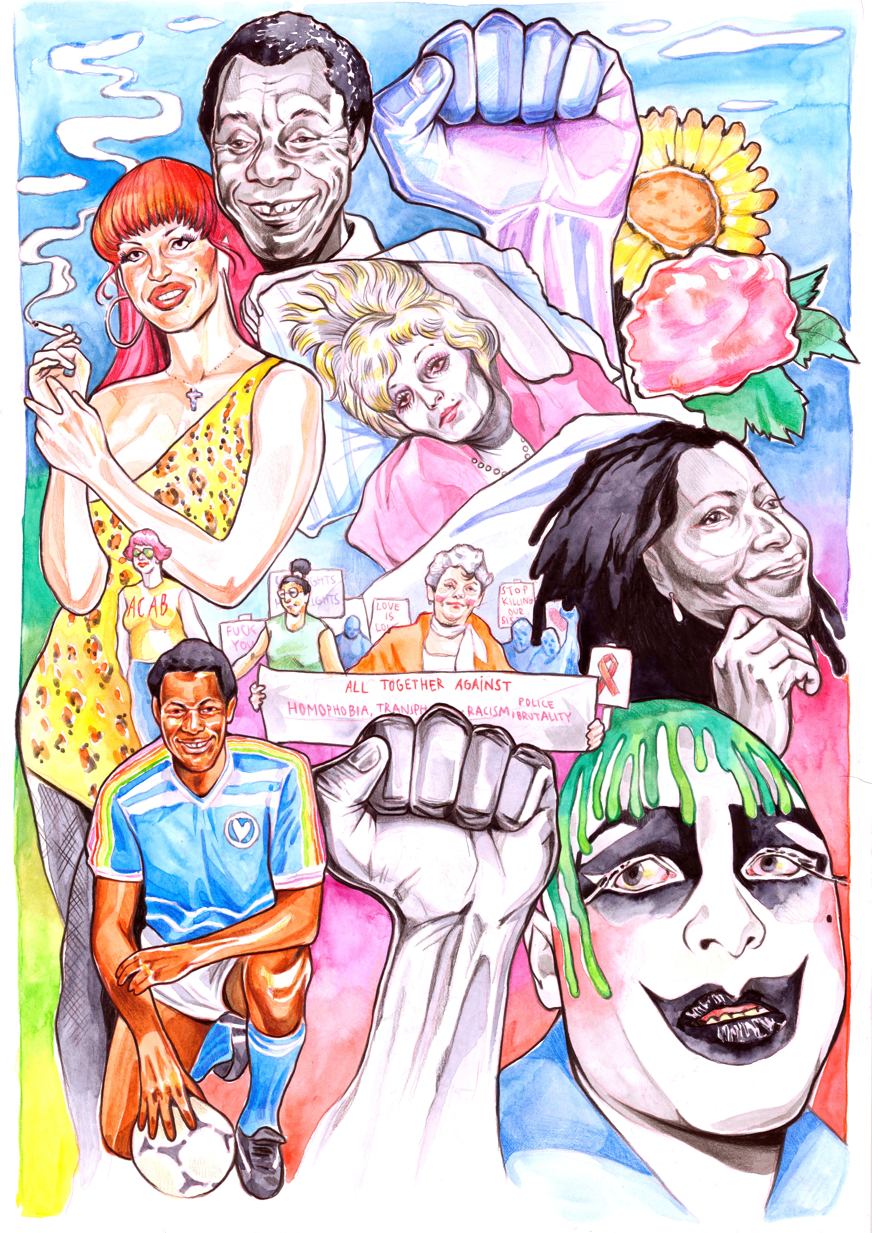
Is FreeTime connected with the latest JW Anderson collab?
Not at all, the collaboration with JW Anderson came from Jonathan's idea of a show in a box: and to illustrate a fictional casting of characters in cheeky expressions.
Tell me about the JW Anderson collab. How did that come about?
The collaboration for the Spring/Summer 2021 Men’s Collection came during lockdown when Jonathan was thinking and figuring out interesting ways to showcase a fashion show within the new reality of the pandemic. He came up with the idea of a show in a box, making it all about the tactile experience, the ephemera, the little bits of information in a very poetic way. Then he proposed to create a series of fictional characters to do the casting for the looks, then shot dummies without actual models. I illustrated a casting of 15 faces which they turned to masks and then a couple of illustrations in blue and red for the big prints.
How does it feel to have your artwork shown on such a notable brand?
To be able to collaborate with him and his team is always a dream. From the t-shirts, to doing the outside of their store, to being in Soho for London Gay Pride 2019, it’s always amazing.

What’s it like working with Jonathan? What is your collaborative process?
Working with Jonathan is amazing, I really admire his passion for craft, design and art, and how he endorses young artists. He is someone extremely creative who always thinks outside the box and is very easy to engage and get excited.
What does your art add to the fashion conversation?
The fashion conversation looks pretty saturated, but I am happy to see my illustrations on JW Anderson, as red and blue portraits, which might invite viewers to get to know more of my drawings.
I love the monochromatic illustrations! What’s the story behind the color scheme?
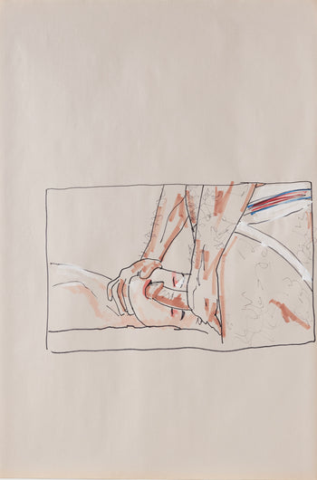
FreeTime's first fanzine was all drawn in blue. Drawing in blue has always been the way I build a drawing while I'm sketching and drafting. Blue happens to be a color that sets backwards and calm, full monochromatic blue drawing for me is a way to seek for softness, quietness. And the opposite for red drawing. It’s always fun playing with colors.
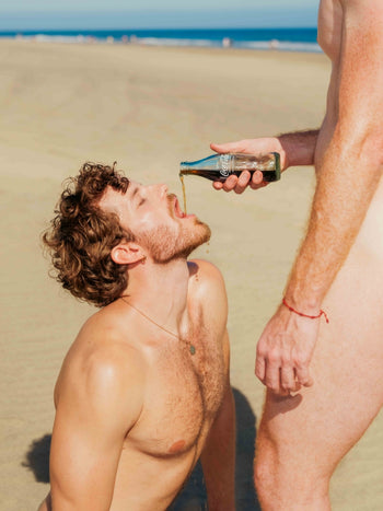
Have you always been drawn to erotic content?
Yes, a big part of my sexual awaking was comic books and erotic comics from the 80s. Artists like Enki Bilal, Milo Manara, RanXerox by Tanino Liberatore and the spanish 'El Vibora'. Those blew my mind and led me to discover Tom of Finland, Harry Bush, Jiraya, Bill Ward, and many more. I became obsessed with how they depicted erotism and such energy, in their very different ways. Somehow with printed editions, there is a bond between the book, its content, and the viewer.
Being a Tom of Finland aficionado, I can see a clear dialogue between your work and his.
Tom's work blows my mind, and it has been a great influence, he was a trailblazer. Other major influences are Harry Bush for his softness, Bill Ward's comics, and Patrick Angus for his sense of voyeurism.

What is the significance of “queer ephermera” to you? How does it influence your work?
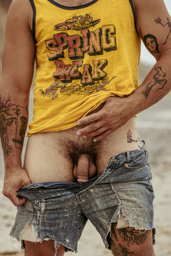
To me queer ephemera is somehow the queer blueprint. Past editions of fanzines, flyers, tshirts, badges… things that were illigal at times, DIY made, spread important messages, symbolized a fight… those are queer revolutionary 'tokens' as they depict community and irreverance. This communication system and the print it leaves amazes me, and being drawn to all this ephemera was a strong push to start FreeTime, where the first shirts were inspired by old punk t-shirts I used to wear. Mine had inclusive and strong messages: ComeASSYouAre, HappyCock, and ItTakesGutsToBeAFairy. Same for Illustration and keeping sketchbooks full of drafts and drawings as a personal diary. Many artists I look up to have kept diaries: David Wojnarowicz, Paul Thek, Tom of Finland, Patrick Angus… as a way to understand themselves, a helpful way to document and dive into your own universe.

Anyone you’re dying to work with, or draw?
I would love to do big murals. To paint a dungeon or labyrinth would be great.
Do you have other JW Anderson collaborations coming up? Or other projects?
There are a couple of things I am working on at the moment that I am very excited for! Surpriseeee…